BACKGROUND
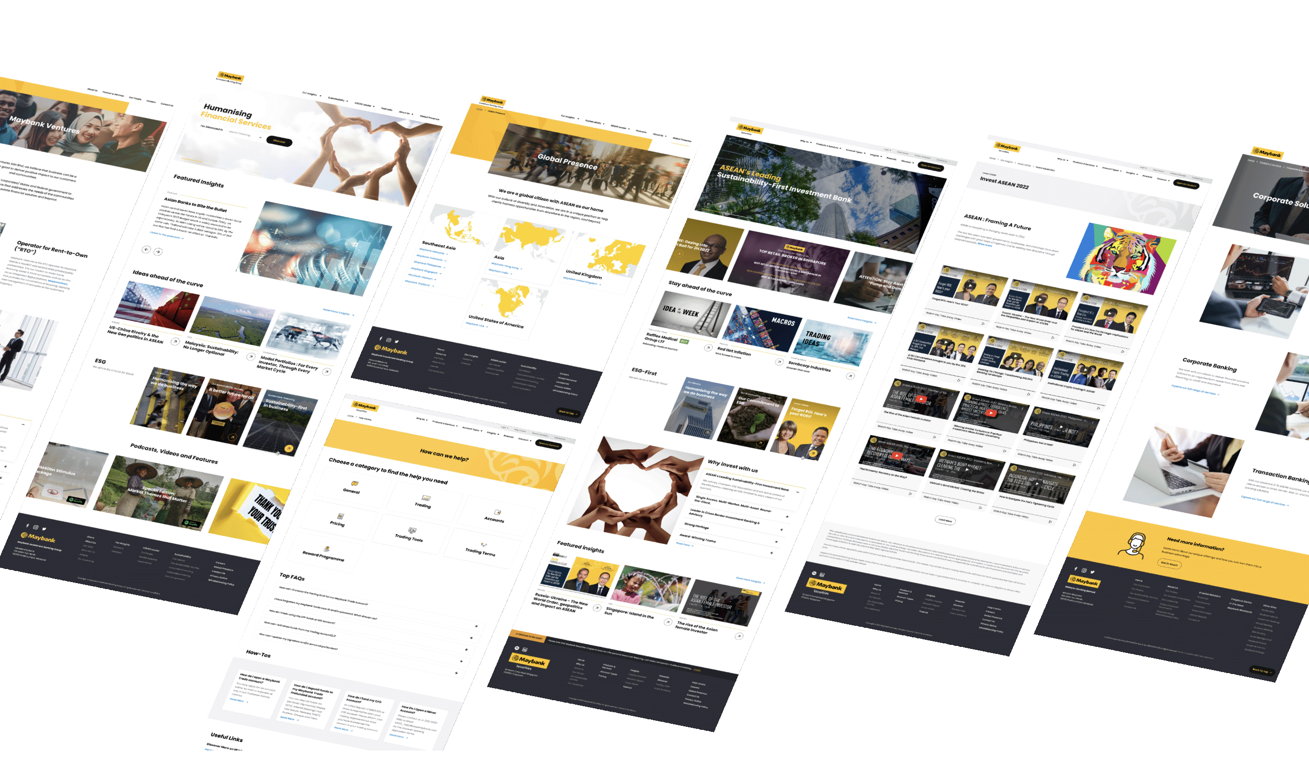
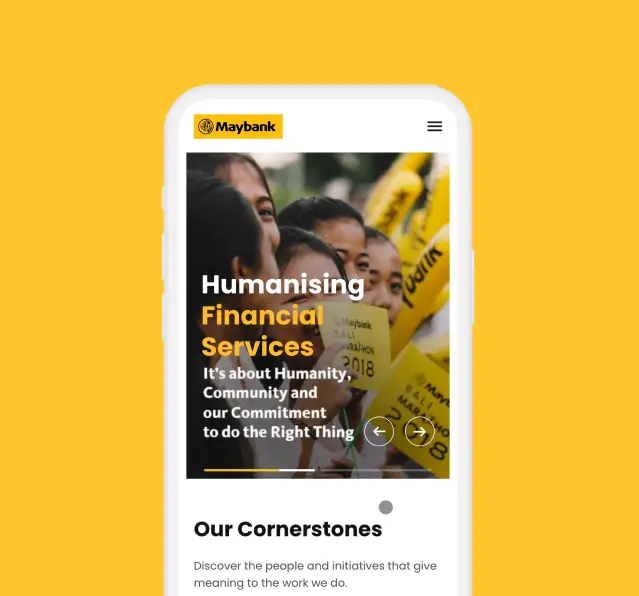
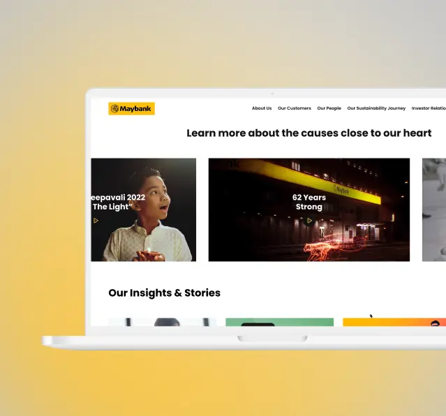
As part of their commitment to remaining at the forefront of the banking industry, Maybank, a leading financial institution in Southeast Asia, recognised the need to revitalise their websites across all business verticals.
Our UX team at C27 saw the need for a design management strategy that would streamline the design process, reduce inconsistencies, and ensure a consistent visual identity across all digital touch points while allowing for flexibility and innovation. We chose an adaptable design library to help us achieve these objectives while also ensuring a consistent and scalable design system across all products and platforms.
-
Client
Maybank Berhad
Maybank Kim Eng Ltd. -
Year
2020 - 2022
-
Area of Work
Information Architecture
Content Strategy
UX Design
UI Design
Design System
UX Writing & Copywriting
Icon Design
-
Client
Maybank Berhad
Maybank Kim Eng Ltd. -
Year
2020 - 2022
-
Area of Work
Information Architecture
Content Strategy
UX Design
UI Design
Design System
UX Writing & Copywriting
Icon Design
BACKGROUND
As part of their commitment to remaining at the forefront of the banking industry, Maybank, a leading financial institution in Southeast Asia, recognised the need to revitalise their websites across all business verticals.
Our UX team at C27 saw the need for a design management strategy that would streamline the design process, reduce inconsistencies, and ensure a consistent visual identity across all digital touch points while allowing for flexibility and innovation. We chose an adaptable design library to help us achieve these objectives while also ensuring a consistent and scalable design system across all products and platforms.
THE GOALS
01
Modernise the Maybank Corporate Site
Redesign Maybank’s main corporate website to reflect their commitment to customer-centricity. Create an engaging, intuitive, and user-friendly design for both current and potential customers.
02
Rework Information Architecture for Improved Findability
Improve Maybank’s information architecture so that users can easily find what they need. Improve the organisation and structure of content for a better user experience.
03
Develop a Content Strategy for Diverse Customer Segments
Develop a content strategy that will appeal to a wider range of customers, including young customers. Customise the content to their needs and preferences while maintaining Maybank’s brand identity.
04
Managing Design with Adaptable Design Library
Create a design management strategy that eliminates inconsistencies and ensures a unified visual identity. To achieve design flexibility while maintaining a scalable and consistent design system, use an adaptable Design Library.
First Stop: Getting The Buy-In
It was critical to get stakeholders on board before we started building our design system to ensure the project’s success. We promoted the initiative in a systematic manner by:
01
A company-wide kick-off presentation in which we shared the current pain points and anticipated benefits of the project for the entire organisation. This to help our client visualise the benefits and potential impact of a design system.
02
Collaborating closely with key stakeholders from different departments and teams to ensure the success and adoption of the design system. This approach helped to ensure that the design system met the needs of all stakeholders, and that they were invested in its success.
03
Starting small. To demonstrate the value of the system and build momentum for its adoption, we started small by implementing a pilot project.
Designing The Kit
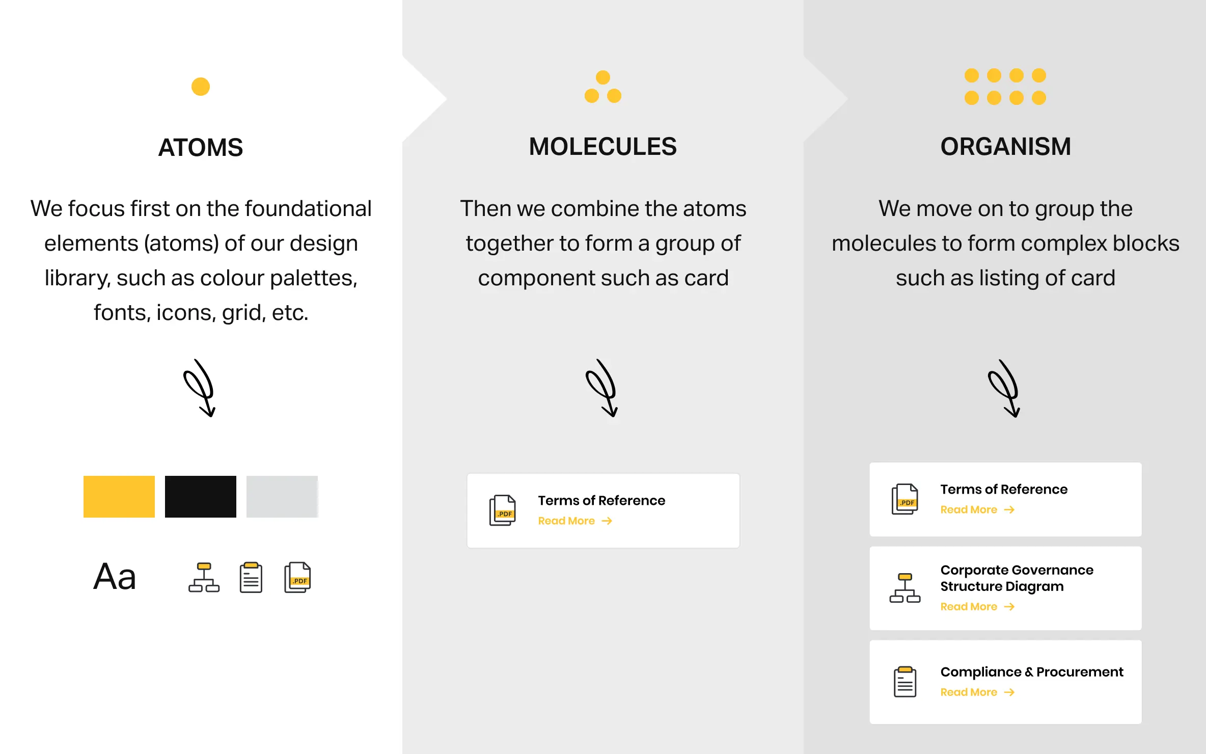
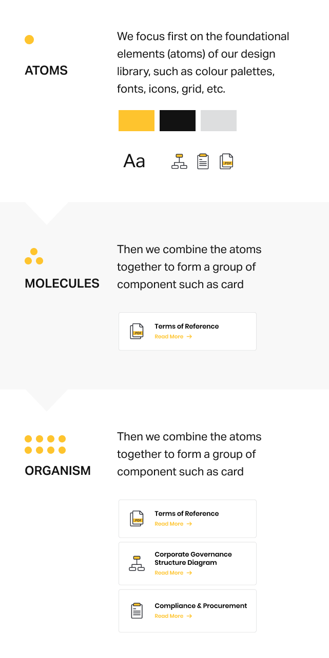
By using Atomic Design principles, we were able to create a scalable and adaptable design system that could accommodate Maybank's growing product portfolio and changing customer needs. The modular design approach allowed us to quickly create and update new components and features.
We started by analysing Maybank's existing design elements and breaking them down into their atomic components, such as buttons, forms, and icons. We then organised these atoms into larger and reusable components.
Hybrid Components
We have moved to evolve the base components to be adapted across the other Maybank projects to fit into the different layouts and functions. Each components retain the same look and feel but now include other parts of different components, unique to each site
Icons
Two set of icons was used for this, System Icons and Product Icons. These two sets of icon serve different purposes and functions and is reduced to its minimum form and expresses its main characteristics.
Along with providing guidelines for their use and placement within the interface, we also made sure the icons were easily scalable and adaptable to various screen sizes and resolutions.
01
System Icons
These include icons for navigation, alerts, and actions that are frequently used throughout the entire organisation. These icons are typically designed to be simple and easy to recognize, with consistent styles and meanings.
02
Product Icons
These are icons that are unique to a certain feature or product. They might be more intricate and detailed than system icons, and they might need to be customised to meet the particular requirements of the product or page.
The Pay Off
The implementation of an Adaptable UI kit and developing modular design components, we were able to significantly reduce the time spent on development for each new project.
This allowed us to allocate more time and resources to creating meaningful content and enhancing the overall user experience. As a result, one website expanded into four distinct sites and continues to grow, demonstrating the effectiveness and scalability of our design system.
